Philo

01What problem did you find?
I could not focus on a page that asked for everything at once
01What problem did you find?
I could not focus on a page that asked for everything at once
Philo started with something I hated in other products: pages diluted with a lot of unrelated things, where I could not settle on one of them. It was the first real project I wanted to ship to users.
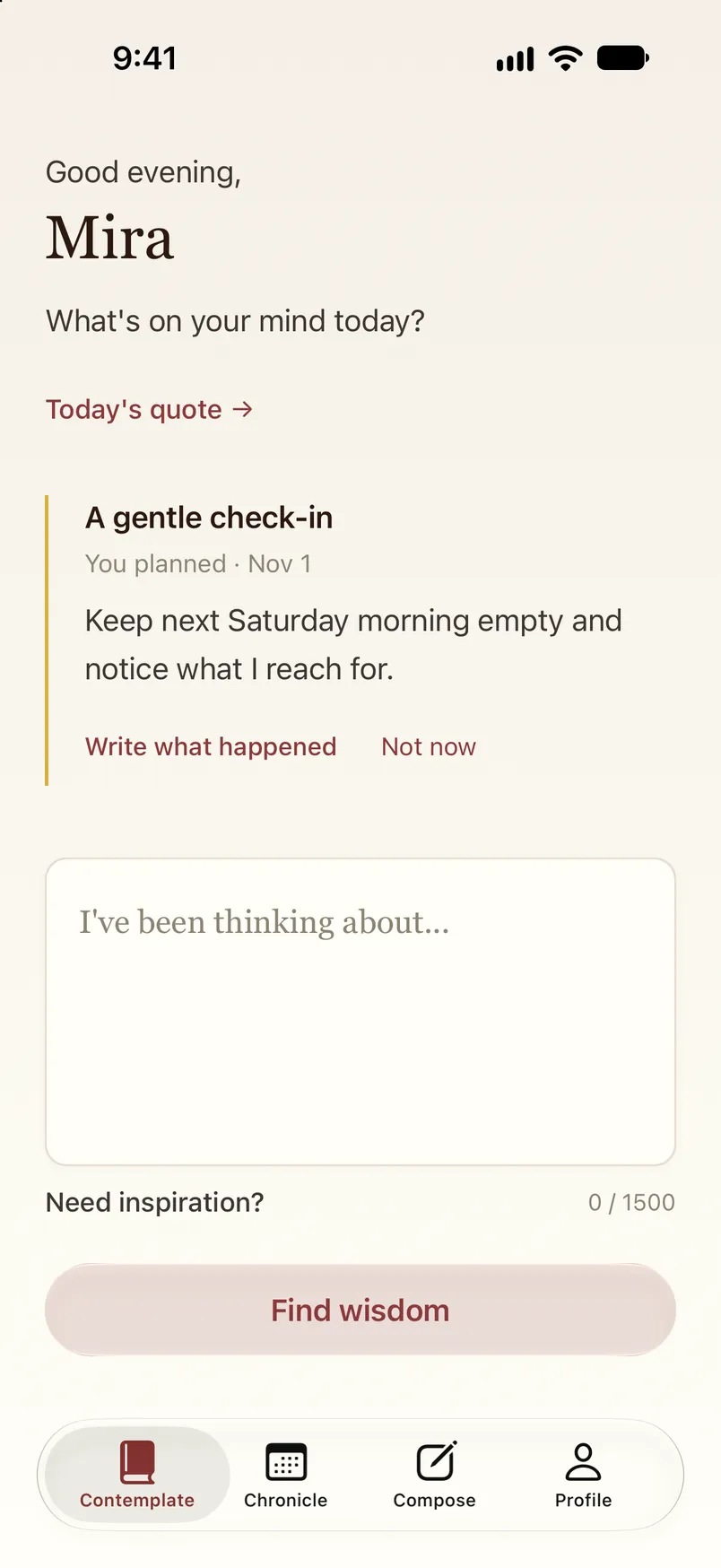
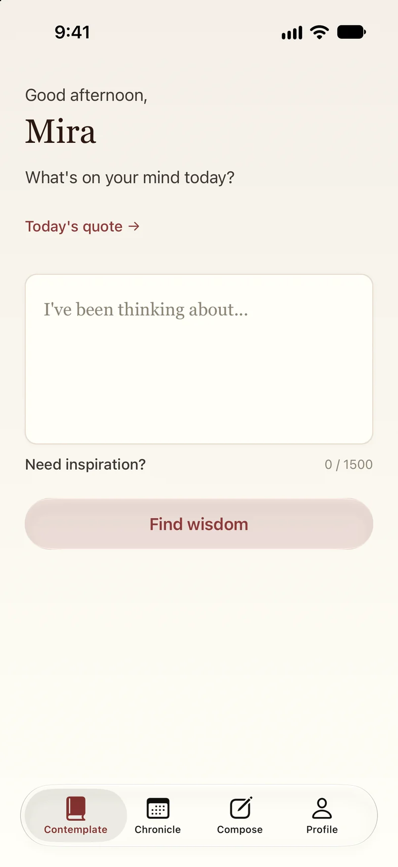
I wanted the opposite: an intuitive, clean experience where you understand what you are looking at and there is a clear way through. Today the app opens on a greeting and one question, what is on your mind.
When you have planned something, one check-in sits above the box, and never more than one. Then the box you came to write in, and one button under it.
02Who was affected?
It was for the people who downloaded it, and for me
02Who was affected?
It was for the people who downloaded it, and for me
The people who downloaded Philo had to find their way around it. It was also for me: I wanted an app I would actually use and like.
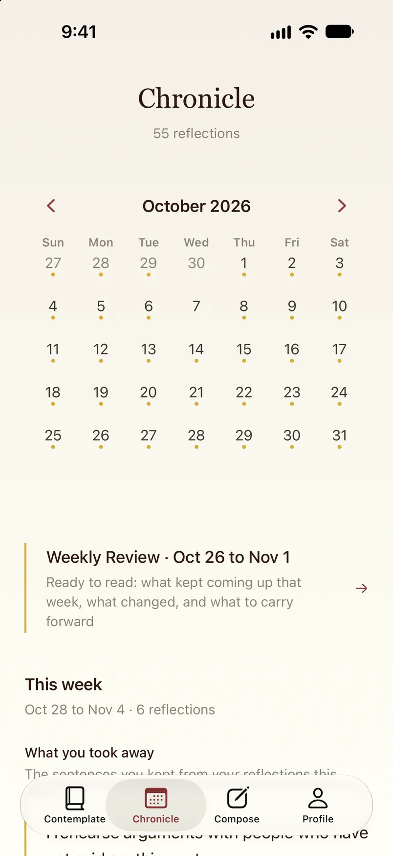
Chronicle is the month at a glance, with a mark under every day that has a reflection.
Under the month, the weekly review is ready to read: what kept coming up, what changed and what to carry forward.
03What was your hypothesis?
A calm, clear page would bring in more people than a busy one
If every page is simple, clear and calm, then more people will come in, because in a philosophical journaling app you do not want a million things in your eyes
04What was your first attempt?
The first version had much more going on
It had no clear visual story and no hierarchy, so people found it hard to move through the app and understand what was happening.
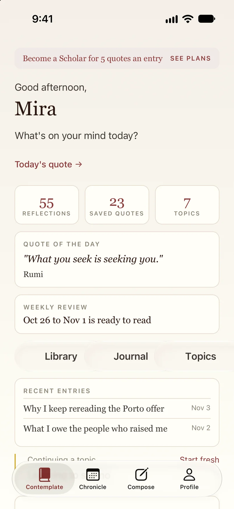
I never saved that version, so the screen here is the current app put back the way it was: a banner first, then counts, all at the same weight, then quote of the day, the weekly review, three buttons and recent entries. Features people ended up liking and using more were hidden among them, and the box you came to write in was pushed below the screen.
05What did later attempts look like, and what was learned?
Every later version offered less on each page
What changed it was talking to users. Once I knew what they actually used and liked, I narrowed down what each page offered and how it was delivered, and then I did it again.
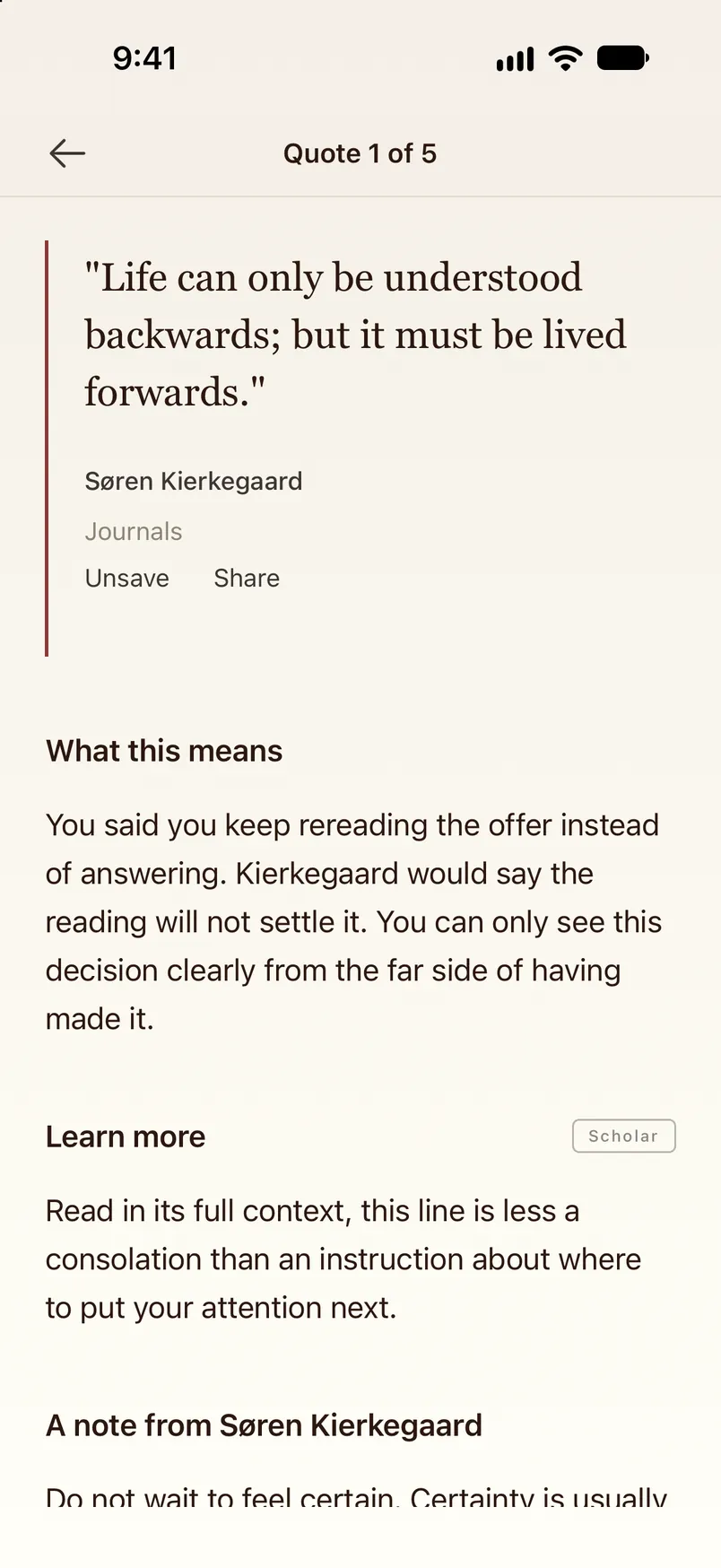
Today, when you press Find wisdom, Philo reads what you wrote for its theme and its tone. It shortlists quotes from its own bank, judges each one for fit, and shows them, then writes a short reflection on each. All of that sits behind one box and one button.
The repo's history tells the same story in its own words. The file behind the opening screen grew from 509 lines to 1,507 while the screen itself showed less.
Show the six commits
- 14 Oct 2025“Initial commit”The opening screen is a greeting, one box and one button, in a file of 509 lines
- 23 Oct 2025“final prod version 1.0.1”, then “now final version lol 1.0.1”Two commits on the same day
- 10 Jul 2026“Release Philo 1.0.5 with Quote of the Day reliability fixes”The quotes screen still carries a label, an ornament, a rule and a footer, and the file is 1,015 lines
- 24 Sep 2026“Ship Philo 1.0.6: Jev-powered quotes, guided reflection, topics, follow-through, principles”Five features arrive and the quotes screen gets shorter in the same commit, at 1,368 lines
- 30 Sep 2026“Home: the continuing-topic line truncates long titles instead of pushing Start fresh off-screen”The same day, “Welcome, sign in and sign up fit one screen without scrolling”
- 4 Oct 2026“1.1.2 (14): widget cold start, a dedicated conversation screen for Philo, a clearer Chronicle week”The source lets the opening screen show at most one topic to continue and one check-in, at 1,507 lines
Sometimes less is more, and constantly building new features does not always make an app more helpful
06How did you iterate and test?
I showed people versions and watched what they used
I showed different versions to friends, family and whoever else I could reach. Talking to users was by far the best way to iterate.
Reviews and analytics helped as well. I tracked how long someone stayed in one state or on one page, and which features were used most, and I put my focus there. This page is doing the same to you right now.
- How it was tested0:00
07What came of it?
People downloaded it, and some of them paid
65,000
downloads of the iOS app, with no paid acquisition
$34K
in revenue, in total
1
person, with no funding
The numbers show that the app I shipped found people without ads, and that some of them paid for it. They cannot show whether calm was the reason, because nothing here sets the busy version beside the calm one.
08What would you do next?
I took the same lesson to Koba
What I learned from how people reacted to Philo went into Koba, an AI assistant for shared expenses that is iMessage first, so instead of putting that effort into screens I pointed the same intuitive feel at the conversation: the journey should be easy and simple to navigate. This is the Koba site, scrolling from its first screen down through the page.
